
 6
6
min
Consider the pen.
There may be flashier, more interesting ways to take notes - but the sheer convenience and effectiveness of the pen makes it indispensable, timeless.
The same logic applies to landing pages.
Brands with an online presence will never not use landing pages because they're simply so effective at capturing leads.
Which is why people spend so much time optimising them - and why you're here now. Let's dive into a few tips:
Why Landing Page Optimisation is Important - Understanding Bounce Rate
Keep The Good Stuff Above The Fold
Use White Space and High Contrast
Use Device Specific Landing Pages
1. Understanding bounce rate
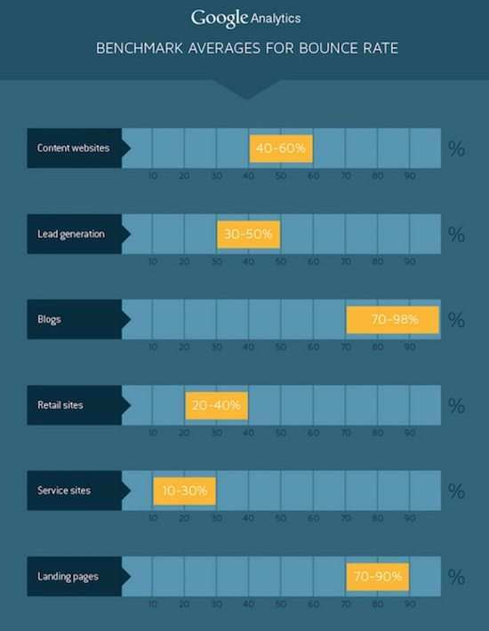
Google Analytics reported a bounce rate of between 70% and 90% for landing pages.
A bounce occurs when a user makes only one request. They open your page, read the information then close the tab. They've bounced. If they open your page, read the information AND follow a CTA then they haven't bounced.
And a high bounce rate, depending on your on page journey for users, isn't a bad thing.
Most landing pages will include a form submission, which links to a 'Thank You' page on submission. Filling out the form counts as an action and, as a result, a high bounce rate here would mean people aren't filling out your form.
So, if you're running forms and suffering from high bounce rates, try the following tips:
2. Shorten Your Copy
Regardless of what it is, we have less time for it.
If the it is your product or service, you better get to the core of it's most valuable proposition as efficiently and quickly as possible. The easiest way to do that is through copy.
And that starts with your headline.
You have only 8 seconds to make a compelling headline, but it's worth it because more than 90% of visitors who read your headline also read your landing page copy.

With headlines, specificity is key. Being specific appeals to our urge to know what we’re getting into when we click – the same reason numbers are effective – and leads to greater clarity, which readers really prefer as seen in this Conductor study.
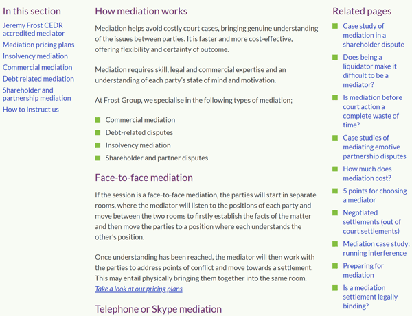
I followed an ad about workplace mediation to land on this page. Where to start? Seeming more like a wiki entry, this is great example of overly long copy.
Novelists and screenwriters are told that if they can't sum up their story in a couple of sentences then they haven't got a worthwhile story. The same applies to your brand, product or service.
Struggling to keep your copy concise? Try this exercise:
- Go to your laptop/PC
- Hit save
- Close the programme
- Close your laptop/PC
- Leave the office
- Do anything other than work
- Better yet, shelf the work until tomorrow. Sleep on your copy
According to Matthew Walker in the book 'Why We Sleep', we naturally filter the redundant information out as we sleep.
"one function of sleep seems to be to shift “recently acquired memories to a more permanent, long-term storage location in the brain”; but it also prunes recent data and throws away what is not deemed useful."
It's been suggested that a 1 second delay in your site speed can result in a 7% reduction in conversions.That extends to load times as well.
Keeping load times low can be as simple as trimming your copy. Keeping images and videos to a bare minimum and making sure you have a valid SSL certificate for your domain.
3. Keep the good stuff above the fold
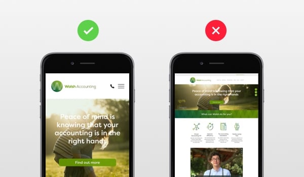
I googled Animation Software to get two adwords landing pages: one had a good above the fold experience and the other had a poor one.
The first example - Ashampoo Movie Studio 2 (electric boogaloo) had a free trial and really intuitive looking user interface but we wouldn't know about it because it was buried below the fold.
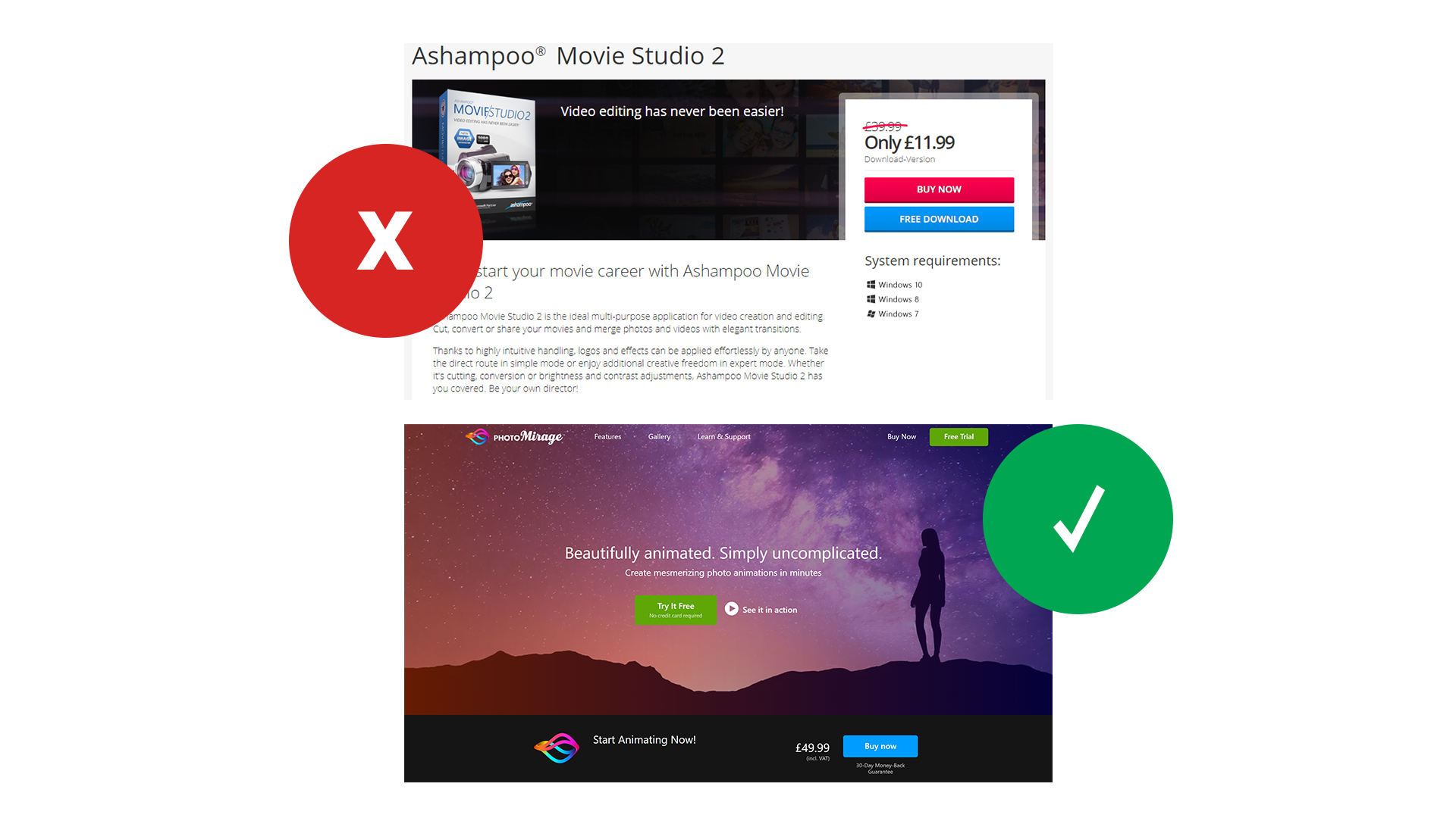
Don't get me wrong, i'm not proposing we're all goldfish - quite the opposite actually. If you give the reader something that makes them want to scroll then they'll do it.
From our own landing pages we've seen that on the pages people stay on they are there for a while - longer than 15 seconds.
The second example - Photomirage showcased the product with a hero section video which sat behind the core value proposition "Beautifully animated, simply uncomplicated." A clear call to action featuring contrasting colours carries the main function of the landing page: to download free trials.
This links to theories of distraction and attention.
Here in lies the beauty of the Photomirage landing page. It's attention ratio (The ratio of clear links on a landing page to the number of campaign conversion goals.) is 1:1. One clear call to action to cover one on page goal.
|
Videos There's an old adage: show, don't tell. The benefits of a video are two-fold, firstly, it saves on precious real estate. The information to space ratio is greatly in our favour. Secondly, you can present your information in a much more engaging manner. Consider your product or service, would it benefit from a video? 9 times out of 10 it will and for some products/services it's near essential (Software). Interactive Form There are certain things on the web that carry connotations and one of them is the dreaded standard HTML form. You know the one I mean. The series of white boxes with questions above. Maybe a few tick boxes. When you see one of these you know you're entering a system of some description. An interactive form, like the one below, is a great way to surprise your prospect and really reduce the innate friction that takes hold whenever a form is required. GIFS And if you need to show someone how something works, a GIF is a great way to do it.
|

4. kEEP IT RELEVANT
Imagine your disappointment when you open a package only to realise the sender has packed the wrong item. Or when the waiter brings your juicy, beef burger only to find a handful of pickles and a slathering of mustard all over it even when you specifically asked for it without.
Either way we know how it feels to have expectations and to be served something completely different to what we were expecting.
So when I googled 'Ford finance options' and was given a landing page with the headline 'Ford Reviews' you can start to imagine how i felt.
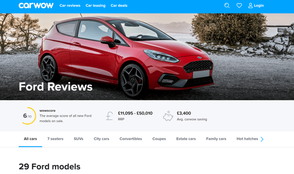
But the attention ratio on this page is probably around 15:1 and at no point has it mentioned finance options - the very keyword they've selected their ad for.
Not only will this irk Google, it'll also irk the people they'll want to be dropping 10+k's on a new car. It's a massive oversight to think that your customers will want to search around your site to find what they wanted.
You need to immediately serve up what your visitor is expecting. Be it through copy, image or video - as long as it acknowledges their search and moves them towards finding a solution.
5. USE DEVICE SPECIFIC LANDING PAGES
Nowadays, is there any reason not to have a mobile optimised site?
But despite more people browsing on mobile, they spend more money and are more likely to convert on a desktop version of a landing page it may be a good idea to think about separate landing pages for each platform.
If you spend anytime thinking about landing page or web design you'll quickly realise that some landing page experiences simply work better on certain platforms. For example, we wanted to develop a tool to show how radio can improve your advertising effectiveness. The customer would put in their nearest city and target demographic and we'd be able to generate a quick audience laydown for their local area. However, the size of the infographic that it spit out varied massively and, in some cases, would be too big to fit on the smaller handheld screens meaning a user would have to zoom and scroll around it.
This is still a great experience for desktop users and we wanted to incorporate it. So, we developed a separate landing page for mobile and we used dynamic parameters to direct users to the relevant landing page depending on what device they're using.
If you've created pages on your site that are designed for specific devices, use the ifmobile and ifnotmobile dynamic parameters in the landing page URLs in your search engine accounts to direct visitors to the correct page depending on the type of device they're using. The search engines determine which URL to use when they serve an ad.
6. Eliminate unnecessary form fields
Taking out form fields is like moving hurdles out of your prospects path.
You're giving them a clearer view of the finish line and the benefits waiting, while reducing the chance of them falling off the track.
According to VWO, removing 3 form fields increases sign up rate by 11%.
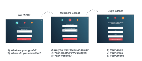
Conversely, there is evidence to support doing the opposite and adding more fields. Unbounce found that more fields can help ease conversion anxiety (The sense of dread you get when you see a form immediately ask for your phone number). But, it has to be done in the right way.
So what is the right way?
Well, Unbounce, the market leading landing page software, believes it's the 'Breadcrumb technique' .
"This is the landing page version of the sales technique called the “Yes Ladder”. It’s the art of eventually getting to what you want (the conversion) as a marketer, by getting visitors to say yes to much smaller requests first."
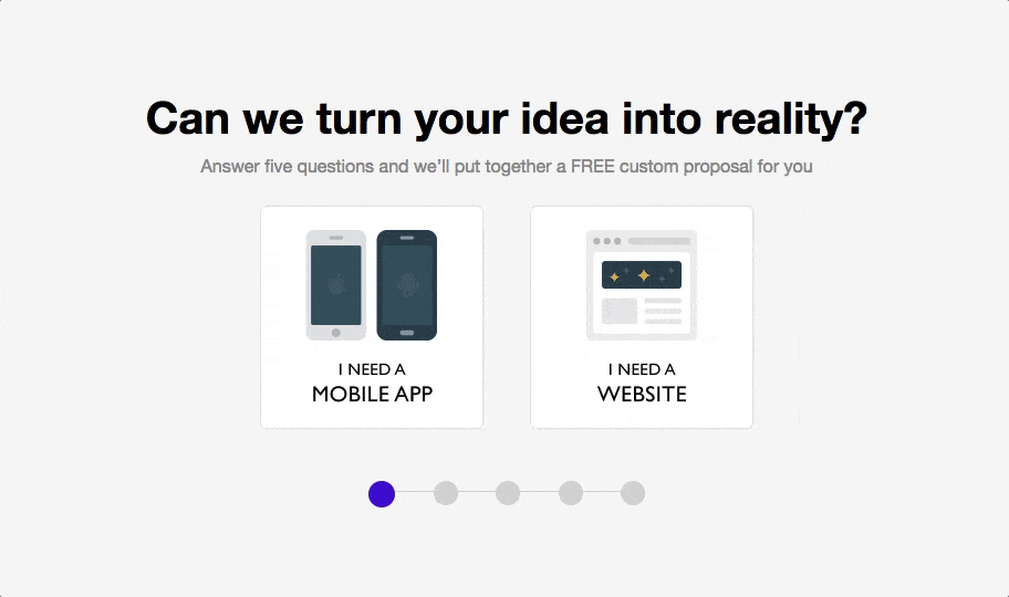
This technique involves compartmentalising your form into steps. This not only makes your form more interactive, it also contributes massively to the breakdown of the conversion anxiety.
So instead of moving those hurdles, you're jazzing them up making them much easier to jump over.
|
Consent This is an easy way to lose a lead or compromise your credibility. To avoid this, include information on your web form that explains why you’re asking for specific information. By anticipating questions your leads may have, you will come off as professional, thoughtful and customer-oriented. Error Messages It's a good idea to tell your customers when they're incorrectly filling out your forms, otherwise they're sure to get frustrated when their submission falls flat. |
7. sticky headers and removing nav
Sticky headers are headers that stay with you as you scroll. They're perfect for keeping the whole point of the landing page, the CTA, top of the page and top of mind.
With the average time people spend on a site being lower than 15 seconds, it's paramount you're keeping your call to action with them as they skim through your page.
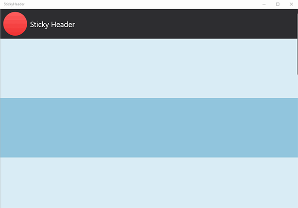
With navigation removed, you'll have plenty of room in your header to put a nice, clear call to action.
Hubspot, after removing nav, had a 16% and 28% lift in MOFU (middle of the funnel) landing pages.